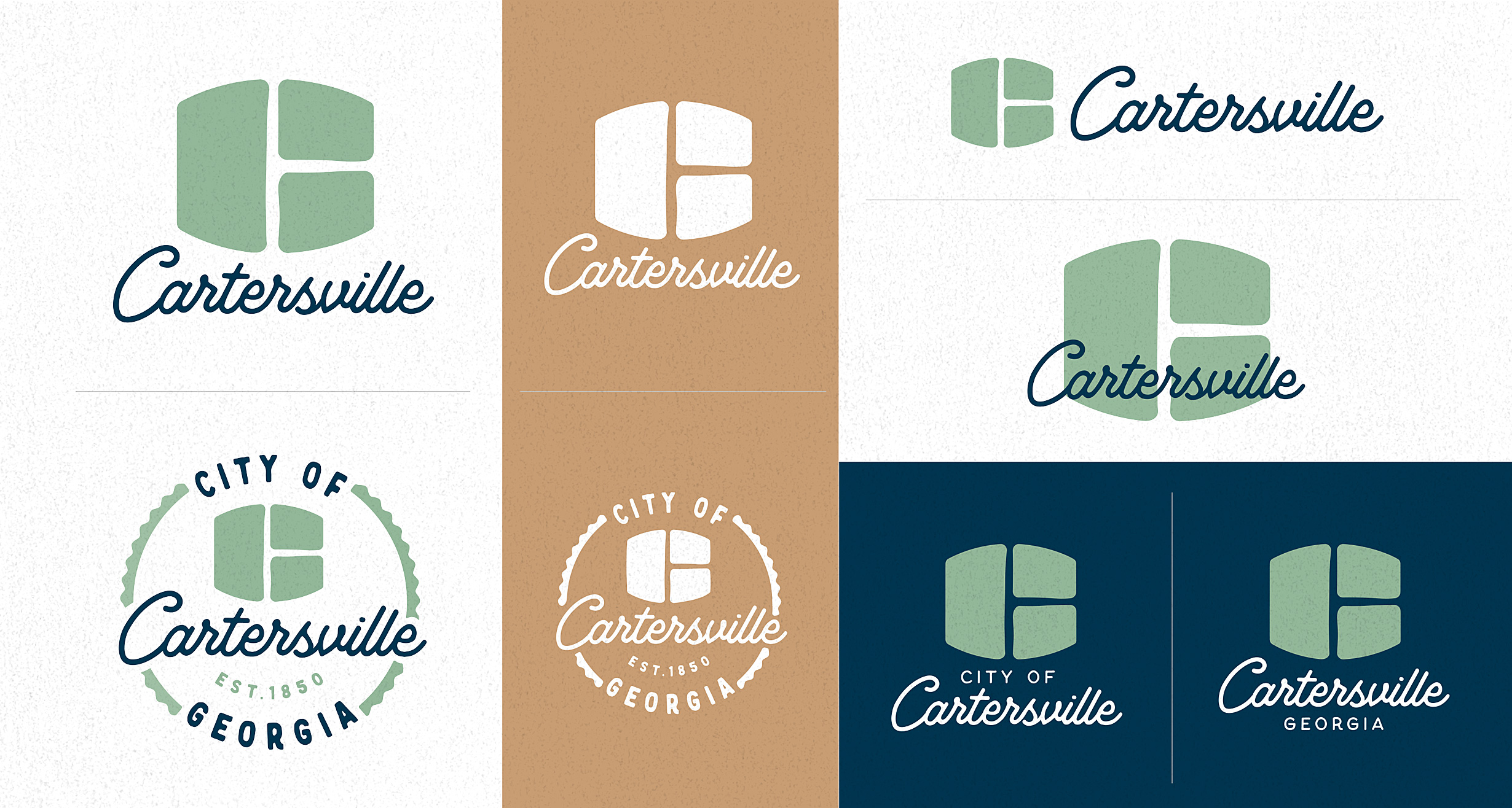


Place branding for a city like Cartersville was a big challenge. How could one symbol capture the depth of our city and all that it has to offer. It would need to function well for the needs of the city government, represent its thriving community, as well as a compelling destination location.
The brief: A flexible, versatile brand symbol and device that is ever-changing, ever-fresh to represent all that Cartersville has to experience.
The solution: The initial letter ‘C’ and an abstract window shape together represents how through every window there is a different perspective of home.


